8 Website Design Mistakes That Are Costing You Customers
Posted: June 9th, 2026
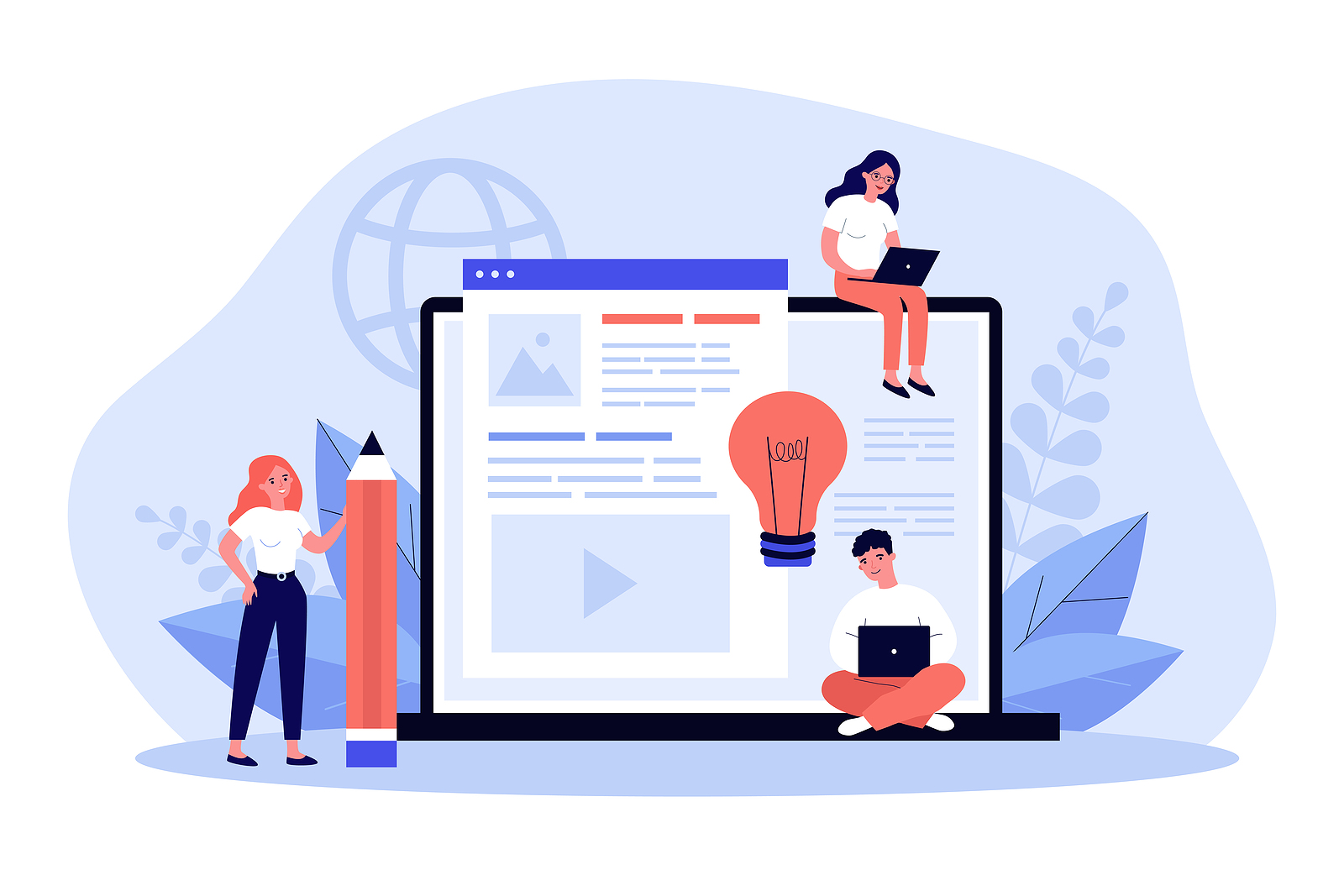
Your website is often the first interaction potential customers will have with your business. Within just a few seconds of landing on your site, visitors will form an opinion about your professionalism, brand and credibility. A visually appealing website will attract attention, but an effective website design goes far beyond just its look and appearance. It needs to provide a seamless user experience (UX), communicate value clearly and guide visitors towards taking action. However, there are some businesses that will get this step completely wrong. In this article, we’ll be going through the eight website design mistakes that are costing you customers.
1. Slow loading speeds
Website speed is one of the most important factors that affect user experience (UX). Modern consumers expect websites to load almost instantly. If your pages take far too long to appear, then visitors are more likely to leave before they even see the content you have on your website. If your website is slow, then there could be a few reasons for this, such as: large image files, excessive plugins, poor-quality hosting, unoptimised code and too many scripts running simultaneously. The fix? Work on mitigating those problems. This includes:
- Compressing images before uploading them
- Minimising unnecessary plugins and scripts
- Investing in reliable website hosting
- Enabling browser caching
- Optimising website code and performance regularly
2. Poor mobile experience
With the majority of internet traffic now coming from mobile devices, having a mobile-friendly website is no longer an option. The issue here is that many businesses still operate websites that display incorrectly on small screens, have small text that cannot be read, feature buttons that are hard, or that cannot be tapped and that load slowly on mobile networks. If users struggle to navigate your website on their smartphone, then they’ll likely leave and visit the site of your competitor instead. If you want to fix this issue, then you should:
- Use responsive design
- Test your website across multiple devices
- Ensure buttons and navigation are mobile-friendly
- Prioritise mobile page speed
3. Confusing navigation
Visitors need to be able to find what they’re looking for easily and quickly. One of the biggest website design mistakes in this sense is creating overly complicated navigation structures that leave users feeling lost. This is an important thing to consider because when users can’t find information quickly, they have the potential to become frustrated and they’ll therefore leave the website. But don’t worry, because there are some ways to fix it, including:
- Keeping menus simple and organised
- Using clear, descriptive labels
- Grouping related pages logically
- Including a search function, where appropriate
4. Lack of clear ‘Calls to Action’ (CTA)
A website needs to guide visitors towards a desired action. This is the same whether you want someone to make a purchase, request a quote, book a consultation or contact your business. Many websites will fail because they don’t clearly tell users what to do next. CTAs with vague wording, poor button placement, inconsistent messaging ot too many competing actions will perform more poorly than ones that use clear, action-oriented phrases, such as:
- Get a free quote
- Book a consultation
- Contact our team
- Start your free trial
The issue is, without clear direction, visitors may leave your website without converting, even if they’re interested in your service and products. With this in mind, you should place CTAs prominently throughout your website.
5. Cluttered page layouts
Some businesses attempt to showcase everything all at once, therefore resulting in overcrowded pages that are filled with images, banners, animations and text. If your website is cluttered, then it makes it difficult for website visitors to focus on the information that matters most. It can cause users to quickly become overwhelmed and leave before taking any sort of action.
If this sounds like a problem that your website is having, then here are some ways to fix it. This includes: using white space effectively, simplifying page layouts, prioritising key messages and removing unnecessary elements. A clean and clear website design will often perform far better than a website that is overloaded with text or visual distractions, for instance.
6. Poor readability
Even valuable content loses its effectiveness if visitors struggle to read it. This is why website owners will pay particular attention to content quality, correct spelling and grammar and the utilisation of strong headers and hero text.
There are numerous readability issues that may be affecting your website, such as: small fonts, poor colour contrast, large blocks of text and inconsistent typography. But why does this matter?
Visitors scan the content rather than reading every word. If the information displayed is difficult to digest, then your website visitors may leave before understanding what it is you’re offering. If you want to fix it, think about the following things:
- Use clear, readable fonts
- Break content into shorter paragraphs
- Utilise headings and subheadings
- Ensure a strong contrast between text and background colours
7. Outdated design
An outdated website can damage your credibility in a flash. This is the case regardless of how good your products or services are. Website visitors will often associate website quality with business quality. So if your website looks outdated or your branding is inconsistent, then it’s time for you to start making some updates to your site.
Signs of an outdated website include: old-fashioned layouts, low-resolution images, inconsistent branding and broken design elements. If this sounds like a description of your site, then review your website design regularly and refresh it when necessary to align with modern user expectations and branding standards.
8. Complicated contact/enquiry forms
Many businesses unknowingly reduce enquiries by asking their prospective customers or clients for too much information up front. Long-winded forms or forms that require loads of details about a person can deter customers from making contact with you. Every additional field creates friction in the conversion process, essentially.
With this in mind, you should only request information that is absolutely necessary from your potential customers. This includes maybe two or three pieces of information, like a first name, a phone number or an email address. Keep the form user-friendly and straightforward if you want to make it as quick and simple to use as possible.
With over 20 years of experience, Kumo delivers results-driven digital marketing services designed to help businesses grow online. Our experts in SEO, PPC, content marketing and web design create tailored strategies that boost search rankings, increase website traffic, and drive meaningful conversions. Contact our team today to find out how we can help your business reach its full potential.
Author Biography
Lorna
As an experienced Copywriter, Lorna enjoys creating varied content for an abundance of different industries and sectors. From detailed, informative articles to creative infographics, she's always looking to inject originality into the work she produces. When she isn't working, Lorna runs her own lifestyle blog, plays the guitar and loves to take part in charity runs.
Company Number: 07865143 | Company VAT: 177073296