SEO for Mobiles & Mobile First Indexing: How to Optimise for Mobile SEO
Posted: March 8th, 2019
These days, most of us tend to access the internet via our phones much more often than on a computer. And when it comes to search, 50-60% of Google searches are estimated to be carried out on mobile devices.
For this reason, mobile SEO should play a big part in any SEO campaign.
In this blog post, we outline what mobile SEO is, why it’s important and how you can optimise your site for mobile.
What is Mobile SEO?

It’s fairly self-explanatory: it’s the part of SEO which deals with searches carried out on a mobile phone.
Fundamentally, it boils down to making sure your website is mobile-friendly.
Having a mobile-friendly website has long been a ranking factor for search engines. Back in 2015, Google released a major algorithm update that meant mobile-friendly pages were much more favoured in the SERPs (search engine results pages). It was so significant that it is often referred to as “mobilegeddon”.
Since then, how well your site works on mobile has been one of various different factors determining your site’s position in the search results for a given term.
However, it is now more important than ever to make sure your site is mobile-friendly, because Google is switching to a mobile-first index.
We’ll go into this in more detail later, but this essentially means that the mobile version of your website is the main version that Google will assess when analysing your site.
How do you optimise your site for mobile?
It goes without saying that websites look and function differently on mobile phones than on a desktop browser. We’ve put together a list of actions you need to take to ensure that your site is mobile-friendly.
1. Make sure your text is big enough

When designing your site, remember that everything will be shrunk down on mobile. Therefore, you should make sure that your text is large enough to be read on a small screen without users having to squint.
2. Don’t place links too close together

Like the rest of your text, your links shouldn’t be too small. Not only do they need to be seen, but they also need to be easily clickable.
For this reason, you should also avoid placing links too close together. It runs the risk of users clicking on the wrong link and generally makes for a bad user experience.
3. Get your site as fast as possible
Site speed is always important for SEO, but it is especially important when it comes to mobile. People have much shorter attention spans when using mobile devices. According to Kissmetrics, 40% of visitors will leave a website if it takes less than 3 seconds to load. When you consider the connectivity issues that can occur with mobile browsing, you need to do everything you can to speed up your site.
The main optimisations you can make are making images smaller in size and format, minifying code, eliminating redirects where possible and leveraging browser caching.
4. Implement structured data
This one is especially important if your business has a physical location, such as a store or restaurant. It is one of the things that enables Google to present searchers with information such as address, phone number, etc.
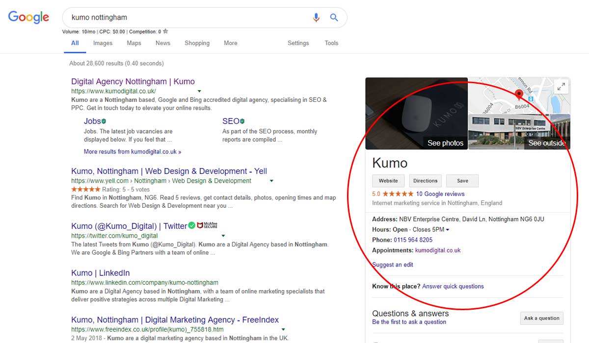
Structured data is information that has been marked up in code in a structured way to provide search engines with specific information about a website or business. It is hidden in the source code of the website. It helps Google to create a knowledge panel like this:
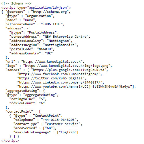
In the code, the structured data looks like this:
You can check whether your site has structured data by using Google’s structured data testing tool and generate your own using the Schema Markup Generator from technicalseo.com.
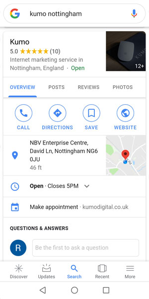
Structured data is all the more important for mobile SEO because in mobile search results, the knowledge panel takes up the whole screen as one of the first results.
It poses an opportunity to advertise and provide information about your businesses, and a risk of not looking professional if there is information missing.
Registering your business with Google My Business also provides additional information for the knowledge panel and allows customers to contact you more easily, as well as leave reviews and ask questions.
5. Design for mobile

As well as all of these practical elements, your site also needs to look good for mobile users. A site where all the text is misaligned, images are too large or in the wrong place, or navigation is difficult, is destined to turn people away.
There are a few different ways in which you can achieve this:
Responsive design
With responsive design, you design one site for both desktop and mobile, but all of the elements are responsive – they automatically resize and rearrange for the type of device you are on. The desktop and mobile sites have the same content and are located on the same URL.
Dynamic serving
Dynamic serving is where a website serves different content to the user depending on what device it is being accessed on. The desktop and mobile content are both located on the same URL, but the site detects whether a computer or a mobile device is being used and delivers different HTML/CSS accordingly. This allows you to create and serve content specifically designed for mobile, which improves user experience.
Mobile subdomain
The final option is to place your mobile site on a separate URL – a mobile subdomain. With this option, if a site is accessed on a mobile device, the site redirects to a mobile subdomain. This is usually the normal address of the site, but with “m.” on the front. This allows a site to be designed specifically for mobile, which usually means it loads very quickly, too.
The mobile-first index
Earlier on in this post, we mentioned Google’s mobile-first index.
Google knows what sites and pages are on the internet by using bots, which crawl the internet and help Google compile its own index of the sites and pages available on the World Wide Web. It’s this index that it refers to in order to deliver us our search results when we Google something.
Previously, Google always used the desktop version of a site as the primary, canonical site for its index. Hence, this is where SEO efforts have historically been directed.
However, in 2016, Google announced it was going to start trialling mobile-first indexing, meaning that it would use the mobile version of a site as the primary version for its index.
As of March last year, they began implementing their mobile-first index. It’s not a separate index – it just means that if sites have a mobile version that follows best practices, this will be indexed as the main version of the site.
How do you make sure your site is ready for mobile-first indexing?
If your site is responsive, you don’t need to do anything beyond the optimisations for mobile listed above. This is because your desktop and mobile sites have the same content.
If your site has dynamic serving or a mobile subdomain, you need to make sure that the content that is served specifically to mobile is of sufficient quantity and quality if you want your site to rank. Google has also compiled a list of best practices to follow for your dynamic or m-domain mobile site, which you can view here.
At the end of the day, for SEO purposes, you need to think of your mobile site as the primary version of your site. Any SEO techniques and principles you would normally apply to your desktop site need to be implemented on a mobile-first.
To conclude
- Mobile-friendly has been an important ranking factor for a while
- More important than ever due to mobile-first indexing
- Make sure your site is optimised for mobile devices in terms of size, speed and design
- Make sure your site is ready for mobile-first indexing with a responsive design or a fully optimised dynamic or m.-domain site
- Think of the mobile version as the main version of your site
Hopefully, you’ve found this a useful insight into the world of mobile SEO and mobile-first indexing. For more SEO resources, make sure you check out the rest of our Beginner SEO series!
Author Biography
Rachel
Rachel has been working at Kumo since the start of 2018 and is a Search Engine Marketer and Head of Content. She makes sure all Kumo's clients always have fresh, engaging content that helps their websites rank and attract links.
She is also fluent in German, which comes in handy for any German websites that need content and SEO work!
Company Number: 07865143 | Company VAT: 177073296